
A long time ago, I accidentally made this image. And recently, I decided I wanted to make a t-shirt from it. Unfortunately, its resolution is way too low to print on media larger than a pin. So I’ve spent way too much time trying to re-create it from the original data. I got it maybe 99% the same, so that’s good enough.
Each image is a correlation network of frequent word stems from an old public database of 18 chunks of English text: 10 from Twitter, 4 from news and 4 from blogs. Each node is a word stem that occurs at least lowfreq times across all chunks. Those little rectangular nodes each contain a written word stem, which would be visible in the correct version of the graph. But nobody likes words in art. Two nodes are joined by an edge when their counts have a correlation of at least corThreshold. So a lower lowfreq allows more nodes. And a lower corThreshold allows more edges. The graphs were drawn with Rgraphviz which decides how the edges and nodes are laid out.
The problem was that the original image was just an error in an assignment in a data science class, and I had quickly moved on from that error, leaving few clues as to how I created it. And now, years later, I had to re-learn how the code works and find that old database (which thankfully is still online) and then try to walk back the steps. Well I didn’t walk back the steps so much as randomly try different values and then look at the images. I spent a long while doing that, and I got to a point that I realized two things. First, that the images I rendered are so close to the original that the Rgraphviz layout must be deterministic, so I can definitely re-create that image. And second, that there are too many possible combinations to do this search manually. Also, the code libraries have since had many updates and don’t work exactly the same as they did. So, lots of obstacles.
There are a few details that I consider essential to my enjoyment of the image:
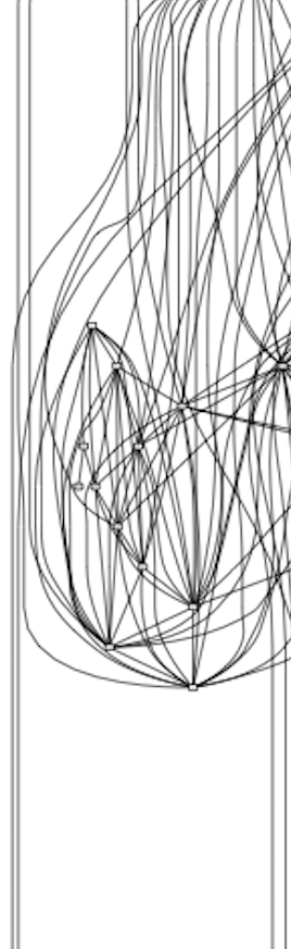
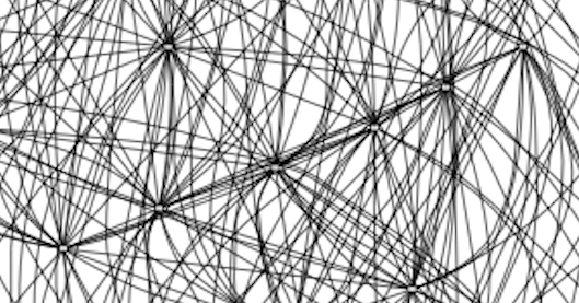

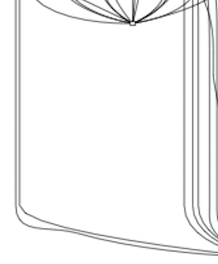
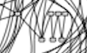
So I vibed a program to render all the images from a range of values, and a script to display them with sliders and mouseover so I can just scroll around and see what matches. There are 781 parameter combinations, which produce 553 distinct graphs.
Move the pointer over the image to change the parameters.
Horizontal position sets corThreshold, from 0.840 to 0.910 in steps of 0.001.
Vertical position sets lowfreq, from 7,500 to 8,500 in steps of 100.
The sliders do the same, and either axis can be locked.
The caption below the image shows the current values, the number of nodes and edges, and the image filename.
The graphs above use a steps of 0.001 for corThreshold (ct), which skips most intermediate graphs. I found that holding lowfreq (lf) at 8000 had the two closest matches, ct 8865 and 8922. I found that the number of nodes in the original image is 52, and I found that by counting the nodes in that low-res image again and again and again. But neither of the two closest images produces the zigzag. And I want that zigzag. I’m not able to count the edges so I can’t narrow that down except by seeing if it looks too noisy or not noisy enough.
There’s this thing called stemming which reduces words to their root so that different forms count as the same word. For example, “feeling” and “feels” can be counted as “feel.” I found that there was an older variant of the code where the text cleaning was different. The correct version removed contractions like “don't” along with other stopwords that were considered uninteresting for the purpose. The earlier variant cleaned up the text by replacing every non-letter character with a space. That turns “don't” into “don t“, so “don” becomes one of the 52 most frequent stems (representing “don't“). And “t” gets removed in another clean-up step because it has fewer than three letters. The older variant also changed how the parameters resulted in node numbers, so whereas 8000 in the multi-graph above resulted in 52 nodes, with this “don” variant, lowfreq fixed at 8228 is the only value that gives 52 nodes.
The multi-graph below holds lowfreq fixed at 8228 and with just the steps of corThreshold that result in a distinct graph within a cropped range.
Moving the pointer from left to right raises corThreshold from 0.870 to 0.9105 and removes one edge per step, from 545 down to 458.
Including “don” as a node meant that “feel” got kicked out of the top 52. The 52nd ranked word is “call” with exactly 8228 occurrences. We’re adjusting the threshold of how well a node correlates with other nodes. If at a chosen threshold the correlation is strong enough, an edge is displayed. As we increase that requirement, the weaker connections are dropped from the image, and remaining lines are drawn differently. The connections around “call” and “feel” formed that stubborn tail or island. But without “feel,” as we increase corThreshold, Rgraphviz decides it can pull in that “call” tail into a lovely zigzag. I found the elusive zigzag.
Rebuilding the frustration_of_time correlation plot
The goal
In 2014, during the Coursera Data Science capstone, I made an error-prone word correlation network from the SwiftKey English text data and saved it as frustration_of_time.png because it looked pretty. And then I fixed the errors and moved on with the assignment. Only that low-resolution PNG survived. The goal of this project was to find the exact parameters that produced it, so the same plot could be regenerated as a vector image and printed at any size.
The plot is drawn by tm and Rgraphviz from a document-term matrix built from 18 text chunks (10 Twitter, 4 news, 4 blogs). Two parameters control what it shows:
- lowfreq (lf) drops rare word stems. A stem becomes a node only if it appears at least lf times across all 18 chunks.
- corThreshold (ct) drops weaker correlations. Two nodes are joined by an edge only if their counts across the chunks correlate at ct or higher.
The original has 52 nodes and somewhere around 460 to 520 edges.
What I looked for.
- Swept both parameters.
cap_week2/corplot_multigraph.Rwalks a grid of lf and ct values, works out which cells produce identical graphs, and renders one SVG per distinct graph in parallel. The first sweep (lf 7500 to 8500, ct 0.840 to 0.910) produced 553 distinct graphs in about 90 seconds, inout/. - Built a web scrubber to compare them. The images were converted to WebP and uploaded to WordPress, and
web/scrubber.htmllets you move the pointer over the image to scan through lf and ct, with sliders, axis locks and a live readout. Getting it to run inside WordPress took a separate build (web/scrubber_wordpress.html), because WordPress rewrites characters inside scripts. - Narrowed it to 52 nodes. Only one set of 52 words exists, so lf was effectively settled and only ct mattered. The original grid had skipped most edge counts, so fine sweeps with a ct step of 0.00001 filled in every distinct 52-node graph (
out_lf8000_fine/,out_lf8000_fine_low/). Many were close, but a chain of Twitter words in the lower right (good, love, great, today, follow, thank) always hung off the side, where the original has it tucked inside. - Reproduced the 2014 text cleaning. The old notebook
cap_week2/task_2.2.Rmdreplaced every non-letter character with a space before building the matrix.cap_week2/build_checkpoint_2014clean.Rrebuilds the matrix that way. It changes one of the 52 words:donreplacesfeel. That single word was enough to change the layout. The next section explains why.
Why “don” replaces “feel”
Stemming cuts words down to a common root so that different forms count as one word. “Feel”, “feels” and “feeling” all become feel; “really” becomes realli and “people” becomes peopl. The nodes in the plot are these stems, not whole words.
Before stemming, the text goes through several cleaning steps, and their order matters:
- Stopword removal deletes very common words like “the”, “and” and “is”. tm’s English stopword list includes contractions such as “don’t”, “can’t” and “isn’t”, spelled with the apostrophe.
- In the current cleaning, the apostrophe is still there when stopwords are removed, so “don’t” matches the list and disappears.
- In the 2014 cleaning, every character that isn’t a letter was first replaced with a space. The apostrophe in “don’t” became a space, leaving two words, “don” and “t”. Neither is on the stopword list, so neither is removed. “t” is later dropped for being shorter than 3 letters, but “don” survives as a word of its own.
“Don’t” is extremely common, especially in tweets, so this adds a lot of don. In the 2014-cleaned data don appears 14,167 times, which puts it well inside the most frequent words. In the current data it appears only 344 times, from other uses of the word.
Why it’s feel that drops out: the plot keeps the 52 most frequent stems. In the current data, feel is number 52, with 8,093 occurrences, just above the 53rd word. When don joins the top of the list, every word below it moves down one place, and feel becomes number 53 and falls off. The cutoff for 52 words rises from 8,000 to 8,228, which is why the 2014-cleaned graphs use lf 8228.
None of the candidates is a pixel-perfect match yet, but when that lower right tail tucks in, it was as close as I could get.
Diminishing returns
These were tested and didn’t get any closer to the original:
- An older Graphviz. It turned out Rgraphviz has bundled Graphviz 2.28 since about 2012, so 2014 and today use the same layout engine.
- Word order. All 52 stems are plain lowercase, so no locale or sorting rule could reorder them.
- Plot size and device. Rendering at 10 inches, 12 inches, and the original’s 704 x 627 pixels, with both the Quartz and Cairo devices, changes the layout somewhat, but nothing came out closer than the 12-inch set.
- More edges or fewer. Graphs from 425 to 580 edges, beyond the likely range.
- Other cleaning variants. Keeping straight apostrophes, as a later notebook did, brings
feelback. Keeping accented letters changes nothing. - The 2014 stemmer. SnowballC 0.5.1 produces exactly the same matrix as today’s version.
- The 2014 tm. tm 0.6 installs but fails on R 4.6, so it was left there.
What’s still untested: how the 2014 notebook split the text into documents (the justthese/ folder no longer exists), and running the complete 2014 software stack (R 3.1, tm 0.6, Rgraphviz 2.10) in Docker. That is the likely path to a perfect match, and the most work.
Reproducing
- Software used: R 4.6.1, tm 0.7.19, SnowballC 0.7.1, Rgraphviz 2.56.0 (bundled Graphviz 2.28.0).
- The matrices (
*.RData) are not in git. Rebuild them withcap_week2/task2_corrplot-corpus.Rmd(current cleaning) andRscript cap_week2/build_checkpoint_2014clean.Rfrom the project root (2014 cleaning). - Sweep the closest matches from
cap_week2/:Rscript corplot_multigraph.R --checkpoint ../dtm_checkpoint_2014clean.RData --lf-min 8228 --lf-max 8228 --ct-min 0.870 --ct-max 0.9105 --ct-by 0.00001 --out ../out_2014clean - Run sweeps with Rscript from a terminal, not the RStudio console, because they fork worker processes.
- WebP images are 800 px at quality 85. The
*_wordpress.htmlfiles must be regenerated from the readable versions after any change.